Building an educational start-up is no small feat. We have decided on the various technologies we could implement and a project management framework that will suit our team size. Debating whether or not the MVP (Minimum Viable Product) features should focus more on functionality as opposed to looks has been a constant talking point among the team members. We are not what you call the traditional founders of a start-up, but we have an attitude that drives us to do whatever it takes to showcase our vision.
Our software approach was simple when working on the foundational blocks of building Teachifly. Our core vision was to build a great-looking platform that allows teachers to house their lesson plans in a central bucket without needing to print them. Of course, if they want to, they can still print it. So we got to work by stripping away all the necessary features we initially deemed a high priority and instead started focusing on features classified as high value.
This article will delve into the technical intricacies and explain the overall experience of building out the Teachifly platform.
Understanding teacher needs and challenges
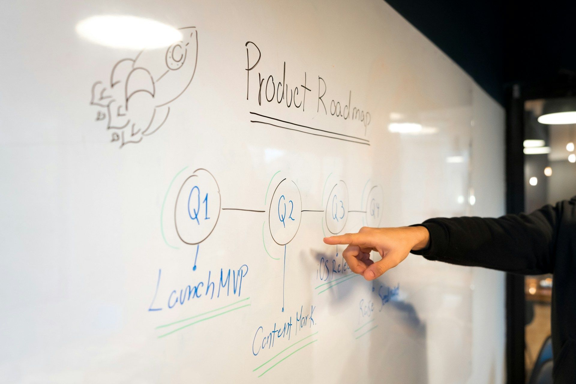
Before our team started the development of the platform, we decided to have a whiteboard session where we bounced ideas around for a couple of hours. Hours turned into days, and eventually, the entire office whiteboard was full of features, software architecture, and user flow diagrams. Looking back at what was on that board and what we have in front of us is fascinating. The way we want teachers to feel when they use Teachifly is the same way we feel about our product.
We are all aware that being a teacher is a demanding and time-consuming career. Today's teachers have access to multiple digital lesson planning platforms that promise to draft lesson plans efficiently. Some prefer to plan the information manually, while others print the digital copy saved on their computer, which then gets stored in a binder. This workflow could potentially turn into an administrative nightmare.
Teachifly decided to tackle this issue by building an intuitive interface that streamlines lesson planning and event schedule in a way that makes sense, all while fostering engagement and accessibility. We stripped away all the complex functionalities and features that would otherwise confuse the teacher and developed a “make the lesson planning process simple” approach.
The key to developing a simple and intuitive platform like Teachifly involves complex and robust technologies that our team efficiently maintains.

Selecting front-end technologies that make sense
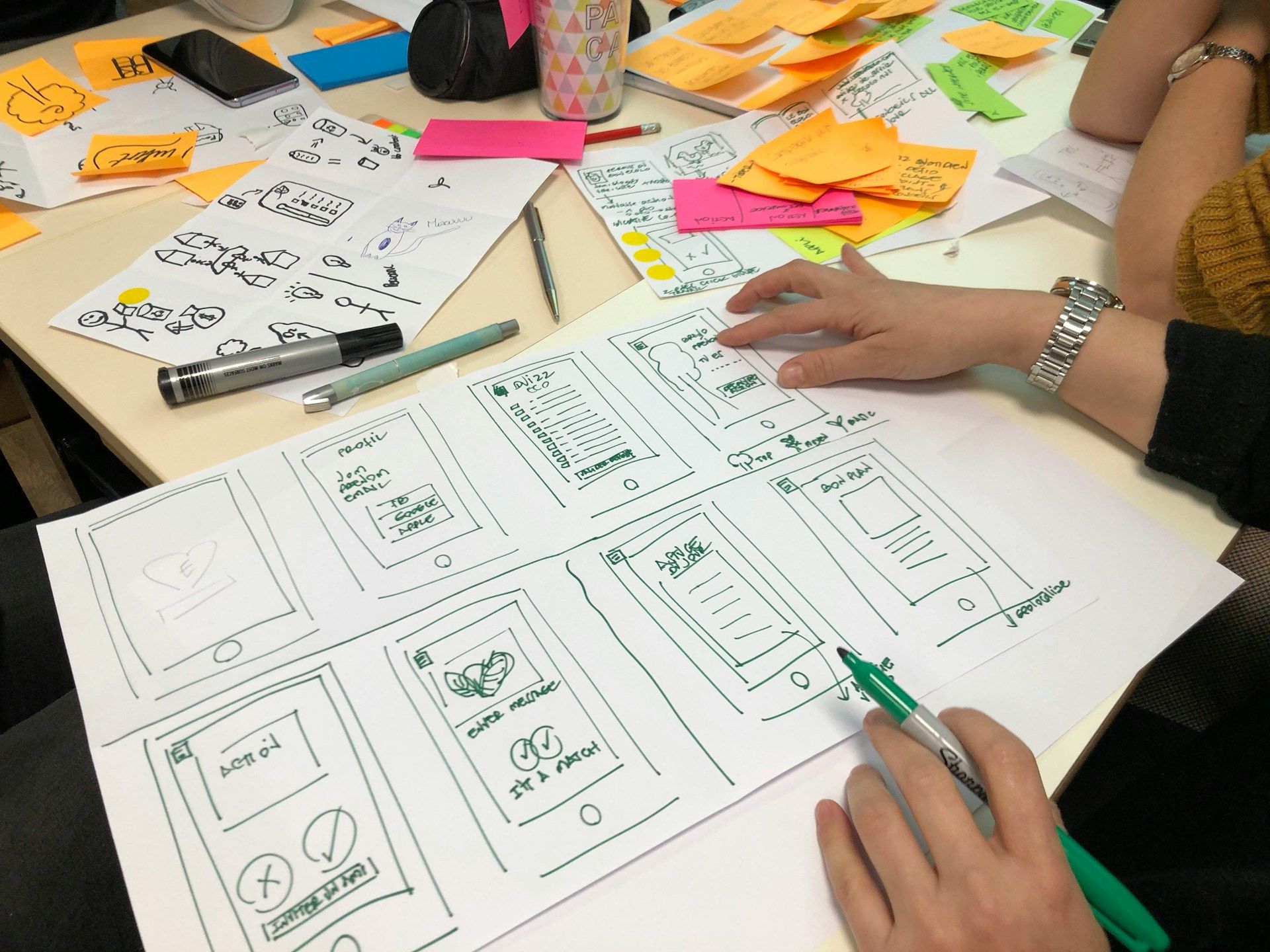
Regarding the user interface of Teachifly, we started with the bare bones by creating low-fidelity wireframes (rough skeleton outlines of the application), we were determined to ensure the page component was positioned with the utmost care and attention to detail. We felt that other platforms were cluttered and sometimes showed too many elements on the screen. Before we started working on the high-fidelity wireframes (the actual look of the application with images and content), we shifted our focus toward creating an atomic design system based on the Tailwind CSS framework. We went with this approach as we were busy building up a library of components that could be copied and pasted to make up a complete component or view.
This approach worked well for us as it ensured consistency from the beginning of the design process. Having the guidelines communicated and enforced allowed us to create an intuitive design system that improved our delivery time for design enhancements.
Once all the design mockups were finished and approved by all stakeholders, we held a short refinement session with the developers to share our thoughts on the high-quality designs. We then proceeded by creating high-fidelity mockups based on the building blocks of the design system we created. The design system completed 90% of the design work, leaving only 10% of the work to place individual components in their proper locations. The development team started coding immediately after the handoff.
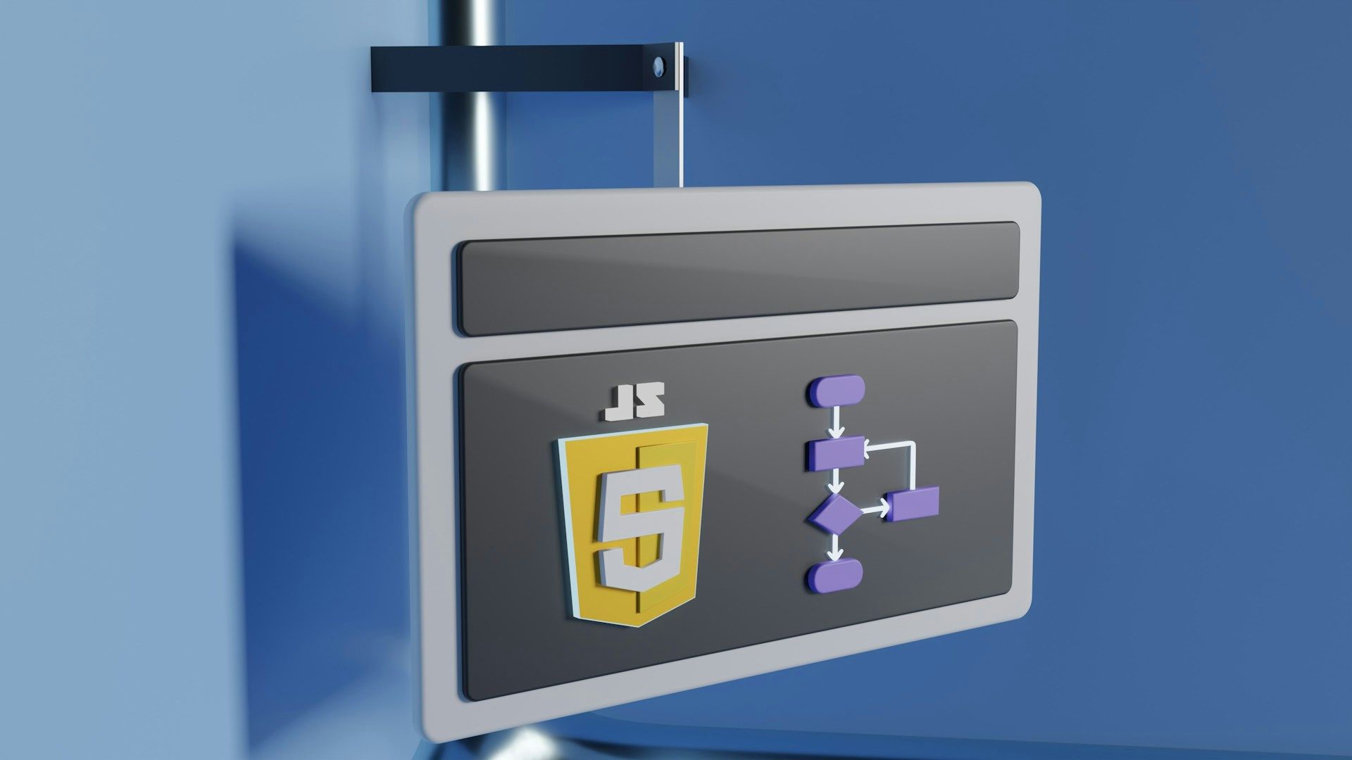
When it comes to development technologies, Teachifly prides itself on using the most modern technologies. This is why we have opted to use Tailwind CSS as our styling framework, thanks to its utility-first approach. For the user interface, we used React as our frontend framework due to its component-based architecture. For state management, we opted for a lighter option in Zustand, as we wanted to avoid the heavy setup when it came to redux. Zustand was all we needed, as it gave us everything we needed to achieve our goal. We've gone with Playwright for end-to-end testing purely because the development team is familiar with it. The development team at Teachifly takes their work seriously to ensure all systems run efficiently and provide the best possible user experience, whether it be on a desktop screen or a mobile device. We built Teachifly with cross-device compatibility to ensure a consistent user experience for all teachers.
Responsive Web Design: Working with Cross-Device Compatibility in Mind
Every front-end developer will confirm that building responsive views is sometimes one of the most tedious tasks of a front-end developer. Likely, this is easily done with frameworks like Bootstrap and Tailwind. However, building custom user interfaces still involves extensive design work. That is why we have our designers from Teachifly to thank for the clean interface in front of us.
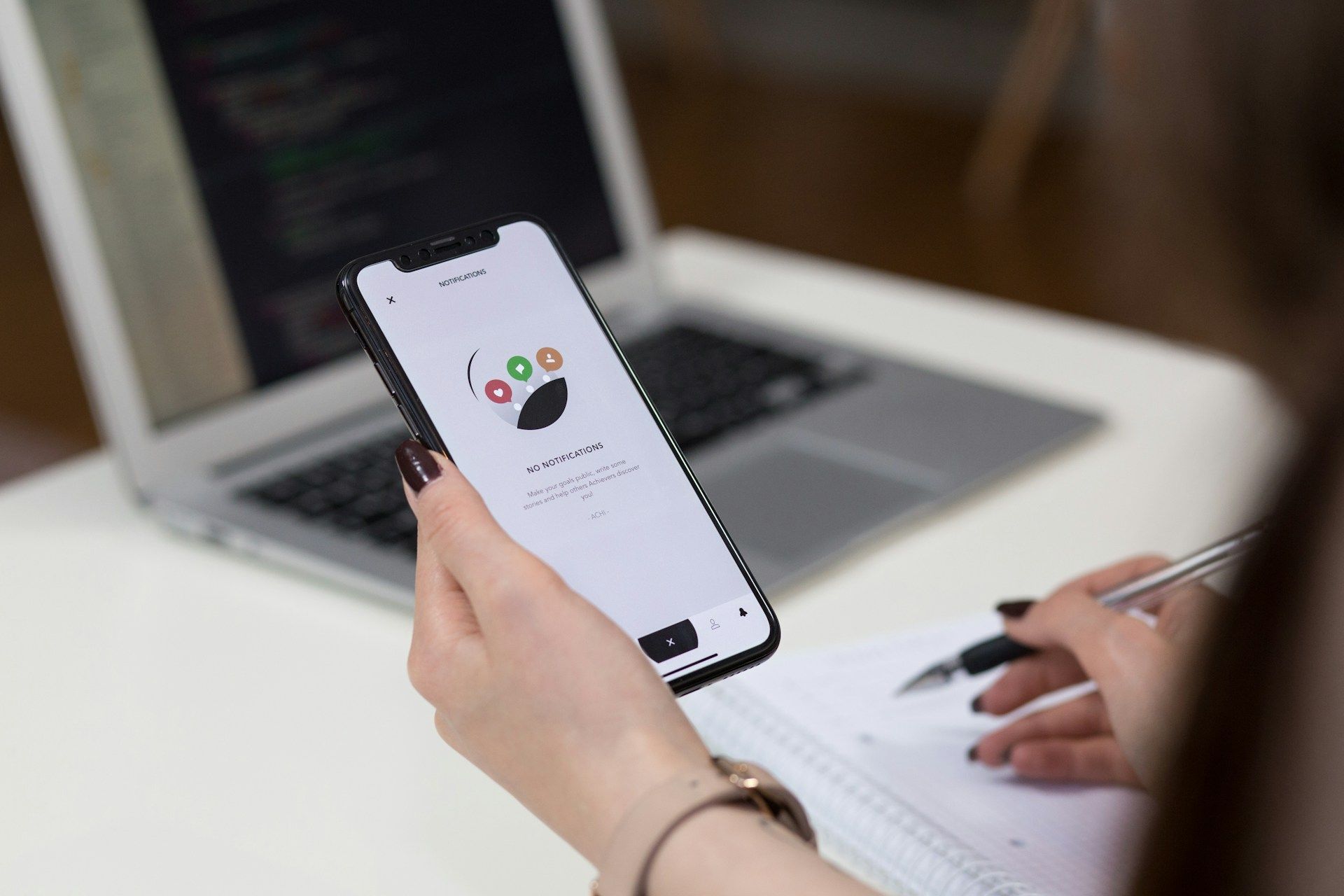
The designers have ensured that the design for the smaller screens is not overwhelmed with unnecessary information. This is why you will find that some information might not be readily available on the mobile view or that the content has been condensed to cater to a more simplified view. You will find that we have catered our design thinking to prioritize information that makes sense to the user on smaller devices.
Since Teachifly is a lean team, we have ensured that everyone plays a part in user testing. How we progress to the testing phase of ensuring Teachifly ships with quality code after every deployment is extremely involved and possibly the most vital part of our feature lifecycle.
Usability testing and iterative design
When it comes to usability and testing, we follow a simple workflow procedure. First, our developers ensure that the feature is working locally. They will then proceed to write end-to-end tests to automate the testing requirements for this feature in the future.
The developer will then proceed to have his code reviewed by another developer, who will then either reject or approve the code review request. This ensures that the code quality within Teachifly is maintained and upheld to a high standard. The person currently assigned to the task will be asked to fix the code before proceeding to QA.
Thirdly, once the code review has been approved, the tech lead will change the status of the ticket to QA (Quality Assurance) in progress. This signals the developer that the code has passed the minimum requirements and that the QA process should catch any bugs. This new feature is deployed in an isolated staging environment that allows us to test the new feature in an environment similar to a production-ready environment. At this stage of the life cycle, the QA ensures that the new feature on staging satisfies the acceptance criteria outlined during sprint planning.
Finally, once the QA has given feedback that everything is good to go, the feature branch will be merged into a release branch where we will perform timed deployments. This ensures that we get to test this new feature as a whole to ensure that it does not break any existing features and behaves as expected.
Conclusion
In conclusion, design in educational software requires a meticulous blend of technical expertise and user-centric design principles. By leveraging frontend technologies effectively and prioritizing teacher needs, developers can create intuitive, accessible, and engaging user experiences that empower educators in their teaching endeavors.
Building a platform such as Teachifly has been a challenging experience, but it is so worth it as we get the chance to create something that aids teachers in becoming more time-efficient.
If you have found this article interesting and think Teachifly could be your partner in achieving efficient lesson planning, consider joining our waitlist. It would be great to find teachers who are interested in being early adopters. So join the community today if you want to have a say in what you want from us as a team.

“Teachifly is lesson planning re-invented for the 21st century. It's intuitive, community-driven, and set up for best teaching practices by default. (Someone at Teachifly)